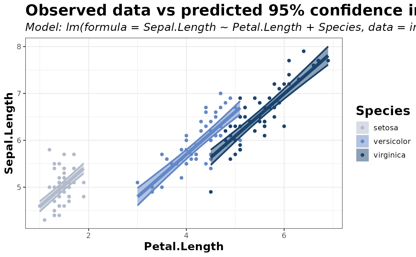
This function uses a model, dataframe, and supplied predictor, response, and group variables to make predictions based off the model over a user-defined length with options to predict over the confidence or prediction interval and to apply a mathematical correction. It then graphs both the real data and the specified interval using 'ggplot2'. You can also choose the color palette from 'scico' palettes.
Usage
predict_plot(
  mod,
  data,
  rvar,
  pvar,
  group = NULL,
  length = 50,
  interval = "confidence",
  correction = "normal",
  palette = "oslo"
)
Arguments
- mod
the model used for predictions
- data
the data used to render the "real" points on the graph and for aggregating groups to determine prediction limits (should be the same as the data used in the model)
- rvar
the response variable (y variable / variable the model is predicting)
- pvar
the predictor variable (x variable / variable the model will predict against)
- group
the group; should be a factor; one response curve will be made for each group
- length
the length of the variable over which to predict (higher = more resolution, essentially)
- interval
the type of interval to predict ("confidence" or "prediction")
- correction
the type of correction to apply to the prediction ("normal", "exponential", or "logit")
- palette
the color palette used to color the graph, with each group corresponding to a color
Value
A plot showing the real data and the model's predicted 95% CI or PI over a number of groups, with optional corrections.
Examples
## Example 1
mod1 <- lm(Sepal.Length ~ Petal.Length + Species, data = iris)
predict_plot(mod1, iris, Sepal.Length, Petal.Length, Species)